Wednesday, January 1, 2020

WILLETT'S POPULAR POTTERY

Brighton on the English Channel is best known for its connection to King George IV when he was Prince Regent for 1811-1820, during the madness of his father, George III. A notorious wastrel whose wantonness in matters pecuniary and amorous made him despised by his subjects, he is nevertheless remembered by his glorious legacy in material matters, the foremost being the Royal Pavilion, his nonpareil oriental fantasy of a palace.


Detail of the Royal Pavilion, John Nash architect. Built 
1815-1823. Author photo.
In the Pavilion's lovely public gardens sits the Brighton Museum and Art Gallery. Though it is a Victorian institution, it is architecturally fitting to its unique, Regency surroundings. Inside, its collection and curation make it an exemplar of a civic museum and art collection, presenting shows for connoisseurs and the simply curious; for visitors with skateboards or walkers; for visitors interested in the deep details of regional history and archaeology, or in the current trends in the city's big and brilliant LGBT community. It balances permanent and temporary shows beautifully; it always feels lively. 


Brighton Museum and Art Gallery.
The greatest permanent exhibit is of Mr. Henry Willett's popular pottery, part of which collection he lent to the new museum in 1873, and all of which was finally donated. Willett believed that in everyday pottery—the sort that common people dined with, that commemorated the great deeds of the day, or that made houses pretty—one could find the history of the Great Britain. His collection certainly makes a convincing case in its amplitude and organization. Willett subdivided it into categories such as Pastimes and Amusements, Military Heroes, Royalty and Loyalty, Crime, Sport, and England and America.


Portrait of Queen Victoria and one of 
her children. Modelled for Minton of 
Staffordshire by George Cocker. Biscuit 
porcelain, ca. 1841. Author photo. 
Brighton Museum and Art Gallery.
I was touched by this figurine of Queen Victoria nestling one of her children in the section on British Royalty. It is biscuit porcelain, that is, unglazed porcelain, giving it a natural glow and translucency that highlight the maternal and spiritual aspects of the tableau. The detail of the ruffles at her collar and and on the baby's gown are exquisitely rendered. The sculptor and every craftsman working along the protracted manufacturing route has given his all to this piece. The production of figurines proceeds from drawing to clay modelling, thence to casting in molds that are subsequently refined. The molds are split into sections to assure that every detail is perfect before the clay pieces are formed, dried, and assembled into one. The molds are destroyed after a small series of perfect figurines are cast.


Portrait of George IV 
wearing star of the 
Order of the Garter.  
Enameled pearlware, 1820. 
Author photo.Brighton 
Museum and Art Gallery.
Foreground: Half-length portrait of Queen 
Caroline on printed, lustered Staffordshire pitcher. 
Ca. 1820.  To the side: Enameled porcelain figure, 
Queen Caroline? Theatrical character? Probably
Staffordshire, ca. 1820. George IV on background 
pitcher. Author photo. Brighton Museum 
and Art Gallery.
Victoria was the niece of George IV, and ascended the throne in 1837, seven years after his death, immediately succeeding her father, George's uncle, William IV. That family cohabits the shelves of Willett's Royalty collection. Here George IV is represented in two aspects. In his blue coat, he appears as if he is the amiable uncle who sneaks you a nip at the Christmas gathering. But on a flowery transferware jug, he gazes into the distance, beyond his suffering wife, Queen Caroline, so hated, betray, and scorned (she was banned from his coronation) that her dour aspect on the lustreware pitcher can be overlooked.


Creamware printed after a design by Tim Bobbin, 
"The Lancashire Hogarth,"depicting a crude 
dental extraction. Ca. 1790. Author photo.
Brighton Museum and Art Gallery.
George IV by Thomas 
Lawrence (1769-1830). 
Reverse of image on jug.
In these pieces we see two more pottery techniques that are common in the Willett's collection. In the late eighteenth- and nineteenth-century,  pearlware and transferware were popular. Pearlware is brightly colored pottery painted in several colors before its final glaze and firing. Only certain pigments can be used in this undercoat because the lead glaze required firing at an extremely high temperature. Pearlware is easy to spot for its liveliness and brilliant surface. Transferware is "printed" pottery. The etching plate from which a picture or words were printed is inked and printed onto special paper, and the image is eventually transferred onto the plate or pot to be further decorated and glazed. The images on the pitchers with George and Caroline can be traced back to popular images of the day copied originally from oil paintings.
Willett's Popular Pottery, Brighton Museum and Art 
Gallery. Author photo.


Earthenware, possibly Northeast England. ca. 1830.
Author photo. Brighton Museum and Art Gallery.
Away from Royalty, which is only a small section of a vast collection, there are so many more gems invoking a rainbow of responses. This is, of course, why Henry Willett was collecting, to capture the whole of British history and experience, from the Kings and Queens to the quack doctors. I enjoyed some direct, hand-painted scenes on plates, like the illustrated definition of a lawsuit and the simple homage to a naval hero.


Shelf display in Willett's Popular Pottery, Brighton Museum and Art Gallery. Individual works form an antic village over which looms the "Grecian Daughter"who consoles the gigantic father (?) in chains. Author photo. Brighton Museum and Art Gallery.
I also enjoyed as a child would the many domestic and landscape scenes, so colorful, imaginative, and droll. Odd scales, bits of folklore added into historical or daily scenes, anachronism, the grand and the quotidian all mixed together in single pieces—and what's more, several pieces shelved together in a sparkling world of generous make-believe! Imagining the craft that went into the making of these whimsical and happy works lifts my heart.


Squirrel in collar and chain, enameled pearlware, Staffordshire, 1790. Pug dogs lying on cushions, soft paste porcelain, Derby or Lowestoft factories, ca. 1760. Bagpiper and woman stand against bocage directing dancing dogs. Staffordshire, 1820. Author photo. Brighton Museum and Art Gallery.


Group, Bud, and Barkage, 2000. Carole
Windham. Handbuilt in earthstone
clay, colored slips, glazes, and enamel.
Author photo. Brighton Museum and
Art Gallery.
Fortunately, the Willett collection has not been allowed to remain closed or static. The Brighton Museum continues to collect pottery that is inspired by the collection or that reflects the founder's interests in the many popular uses of pottery function and designs. Among the contemporary acquisitions on display when I visited in November, 2019 was an immense piece filled to the brim with personal and historical reference. The note told us that it's an homage to the artist Carole Windham's departed dog, Bud. But it also references Staffordshire dogs so often seen in Regency ceramics (see the pugs in the photo above). The tree against which Bud leans is bocage—what supports the entertainers with dancing dogs, and the Grecian daughter. Here, Windham cleverly turns the greenery into doggery, executing the leaves as dog faces to produce "Barkage." I don't know the exact dimensions, but this piece is at least two feet tall, quite an imposing work. With the sturdy, big dog's sorrowful pose and the multitude of up-tilted faces of the crowded "barkage," the piece packs a comic wallop while it delivers considerable subtle feeling too. Windham is definitely working in the right medium. The dog is solid and soft and asks to be touched again, but he also appears to be melting in that softness. But the same medium allows the detail of the many tiny uplifted faces—the angels, or the spirits of Bud—leaning into the act of rising.

The Willett pottery collection is a joy. For me, it was unalloyed fun, in and of itself: It bred curiosity at every turn. For anyone with an interest in social history, British history of the eighteenth or nineteenth century, and for any of Willett's wide-ranging subjects, there is something to surprise and inform here. This is not to mention its importance for collectors and enthusiasts of pottery, for which it is undoubtedly a Destination. 


____________________________________________________________


If you are interested in reading more about the Willett's Popular Pottery or some of the techniques commonly used in the objects, you may be interested in these articles, or in Stella Beddoe's book, A Potted History: Henry Willett’s Ceramic Chronicle of Britain, 2015.

https://museumcrush.org/a-social-history-of-england-via-popular-pottery-the-willett-collection-at-brighton-museum/

http://www.madehow.com/Volume-5/Bisque-Porcelain-Figurine.html
http://www.thepotteries.org/features/pearlware.htm
https://www.transcollectorsclub.org/faqs/new_collector/primer.html

In July 2012, I wrote about the Ohio Craft Museum's show, "Pots with a Purpose," a curated show of contemporary American functional pottery.

Thursday, December 26, 2019

ERIC GILL, DURATION, AND THE DITCHLING MUSEUM


Eric Gill, Spoil Bank crucifix and chapel; paper and ink, 
1919. Collection of Ditchling Museum of Art and Craft. 
Photo, Tessa Hallmann
I wanted to go to the Ditchling Museum in the Sussex village of the same name, when I learned of its association with the artist Eric Gill. I'd become interested in Gill years ago when I learned letterpress printing under the auspices of the Annis Press at Wellesley College. There I became acquainted with Gill as the designer of beautiful type fonts, Perpetua and Gill Sans, so I assumed that the Ditchling Museum would focus on letterpress printing and book arts. It turned out to be the tip of the iceberg. I had known that Gill was also a celebrated stone- and print-maker, but that he had been a magnet for artists who followed him to establish a rural Catholic artists community I hadn't known. What he founded—and abandoned—in Ditchling was both a locus, movement, and inspiration for three generations of brilliant British craftsmen.

In the early years of the last century, overlapping with the arts and crafts movement of William Morris, Gill was a student at the Central School of Arts and Crafts in London, where he studied lettering with Edward Johnston, who would later design the famous London Underground typeface. The two became friends, as Gill did with printer Hilary Peplar. Both Johnston and Peplar moved to the village of Ditchling after Gill moved his family to live a way from the hectic, industrialized world, in 1908.

Guild rules. Text by Eric Gill, lettered by Joseph 
Cribb. 1920s. Author photo.
In 1920, after Gill’s conversion to Catholicism, Peplar, under Gill's leadership, joined engraver Desmond Chute and apprentice letter-cutter Joseph Cribb, to found the Guild of St. Joseph and St. Dominic, a fraternal community for responsible workmanship and self-sufficient living, dedicated to the Dominican life. Within the Guild grounds—with its chapel, studios, and school—printing, stone-cutting, and calligraphy were pursued, and soon weaving, silversmithing, wood carving, and painting too, as more artists moved to Ditchling to join the Guild, attracted both by Gill and the other artists and by the ideals of the life. 

The Guild lasted until 1989, when the property was sold and the buildings razed. Some relatives of the original families are productive artists in the traditions of their grandparents' art forms, living nearby and active in the preservation of the Guild's materials and heritage. On my visit, I met the grand-niece of Eric Gill's brother, Macdonald, who is soon to publish a book on Mac's extraordinary maps.

"Disruption, Devotion, and Distributism," the current show marking the centennial of the founding of the Guild of St. Joseph and St. Dominic, uses every inch of a small museum's space and draws on the breadth of its permanent collection to introduce the heart of Guild's aesthetic, spiritual, and social aspirations. Central in the early days was Hilary Peplar's Stanhope printing press with which he founded St. Dominic's Press. The press was not about fine printing, and Gill's contributions were not typographic (he designed is famous types after he left Ditchling). The array of titles below indicate that the ethical life of Dominican Tertiaries (lay affiliates of the order) was a major part of founding community's work. Gill wrote and Peplar produced pamphlets to give guidance on all aspects of acceptable living, even down to the "UnChristian Apparel favoured by Females" in the Welfare Handbook, Dress.
Welfare Handbooks, 1919-1923; paper and ink. Printed by St. Dominics Press. Photo by Tessa Hallman.


When Gill left in 1924, it was abruptly and had something to do with his colleagues' knowledge of the dichotomy between his ideals and his deeds. Fiona McCarthy's 1989 biography revealed to those of us who weren't there then that Gill had sexual relationships with his sisters, daughters and a dog, on top of being generally overbearing. In the years since McCarthy's biography, Gill's reputation has naturally suffered tremendously, yet his work is remains. Some demanded the removal of his Stations of the Cross in Westminster Cathedral (work on which excused him from serving in World War I) after the revelation of his incest, but the work's merits assure its place despite some outcries. (Illustration right: Eric Gill, Stations of the Cross, panel 3, 4'6," ca. 1915. Westminster Cathedral. Photo from Cathedral website.) 

Philip Hagreen, "Trying to Make Ends Meet," 
wood engraving, 1940s. Reproduced 
by kind permission of the estate of 
Philip Hagreen. Photo courtesy of the 
Ditchling Museum.
Then, too, the Guild survived Gill's sins and flourished on what he had built, as "Disruption, Devotion, and Distributism" amply demonstrates. The show illustrates how each of these principles shaped the Guild not only at its founding but as it continued even after Gil's removal to Capel-y-ffin, Wales, where he established another Catholic workshop. In this show we see prints by Philip Hagreen, who came to Ditchling to study letter cutting and wood engraving, left for Wales with Gill, but returned after a few years on his own. In the current show, there are several of his Distributist woodcuts, decrying the effects of industrialism. These were made in the 1940s, two decades after the Guild's founding. Despite Gill's early departure, the work and faith of early Guild members remained deeply committed. Socially, Hagreen was a Distributist, a champion of returning people to rural settings where they could produce their own food and provide for their own modest basic needs, independent of the degradations of larger economic movements—capitalism or communism alike.


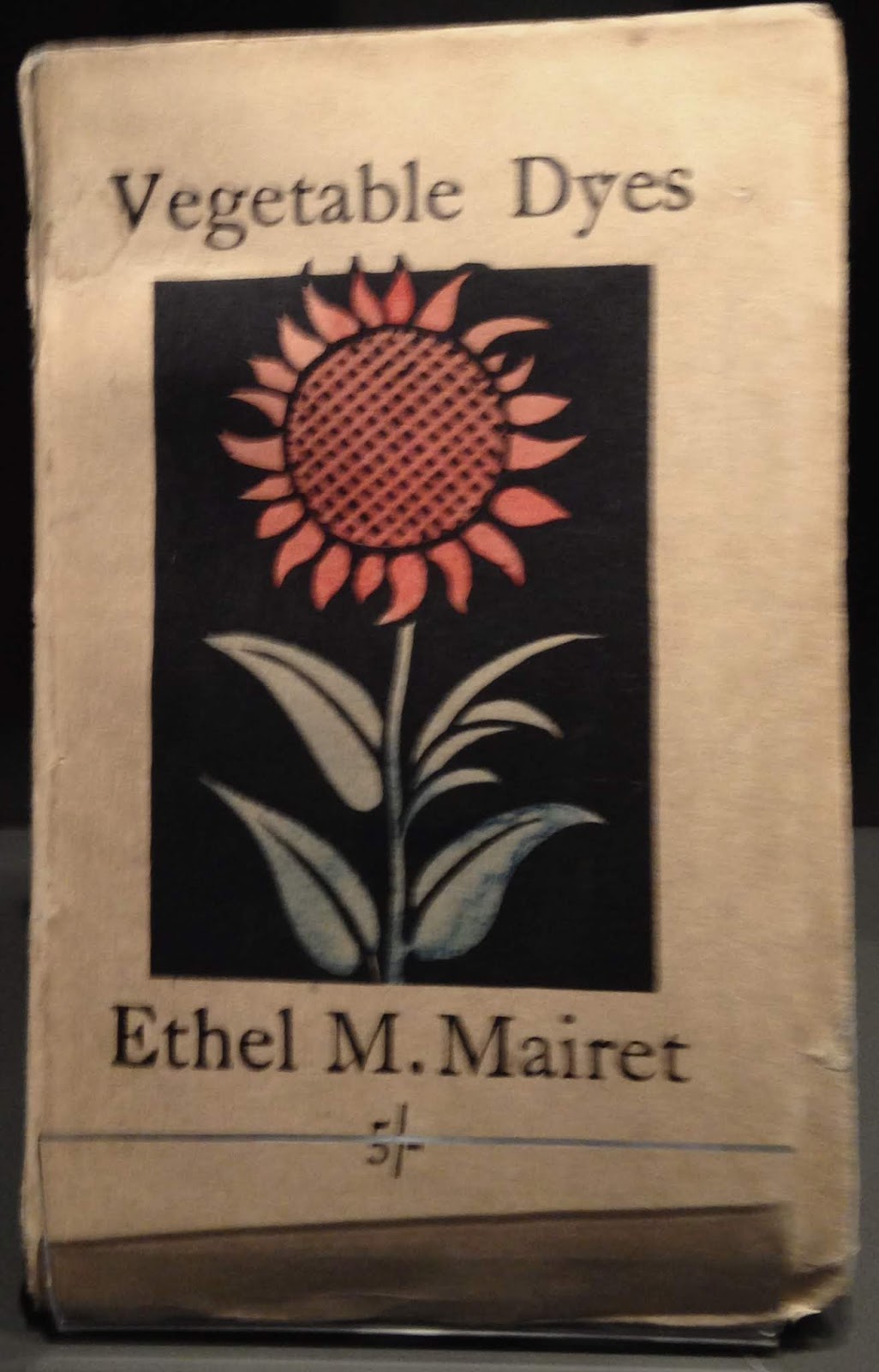
Ethel Mairet, "Vegetable Dyes," 
1924, 4th ed.Wood engraving 
by Eric Gill; printed by St.
Doiminic's Press. Collection 
of Ditchling Museum. 
Author photo.
Valentine KilBride, gold vestment 
detail, 1920s; silk. Collection of 
Ditchling Museum. Worn in
the Guild chapel. Photo courtesy 
of Ditchling
Museum.
Longevity and duration seemed to me to be two of the most outstanding features of the Guild, aside from the brilliance of its individual artisans and their commitments to traditional, honest workmanship. Ethel Mairet—who, because of her gender, never became a member of the Guild—was a major force in Ditchling's creative community, a weaver who literally wrote the book on the sources and use of natural dyes. She attracted Valentine KilBride who learned from her and became a Guild member in 1924, soon setting up shop for himself and specializing for years in liturgical vestments. In time, his daughter, Jenny, became a weaver. She become the first female Guild member in the 1950s, and she is still living in Ditchling, active in dying and silk weaving in 2019.

Another case of duration and longevity within the context of honest workmanship is in the silversmithing of the Pruden family. Dunstan Pruden attended the same arts and crafts college as Gill. As an ardent Catholic, Pruden became interested in Gill's writings. After they met, Gill obtained Pruden a major ecclesiastical commission, one that helped establish his reputation. In the 1930s, Pruden moved to Ditchling and joined the Guild, specializing  in liturgical pieces. Pruden's grandson, Anton, is still silversmithing in Ditchling, using the traditional methods that Dunstan plied.
Dunstan Pruden, "Cavalry Group," brass, 1973. Collection of Anton Prudent. Author photo.
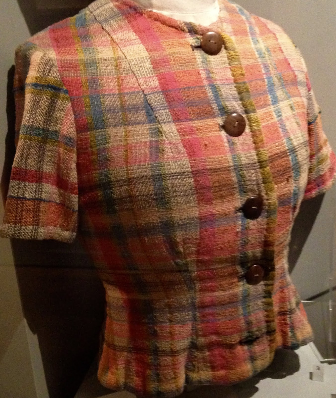
Visiting a show like "Disruption, Devotion, and Distributism"—a show that aims to clarify those founding principles of the Guild—is both illuminating, inspiring, and confusing. The Guild endured for over sixty years, with a mixture of transitory and stable resident artists. There is nothing intrinsic in this show's artifacts to indicate the passage of time. It makes sense: Given the continuity of devotion to traditional methods, simple living, and the integrity of work, it's natural that the work from 1920 and 1950 might not look very different. A jacket woven by Ethel Mairet was undated, as was a gown Valentine KilBride woven and dyed for Mairet. But when? 1920s? '30s? Displayed nearby were samples by Mairet's students, Barbara Allen and Hilary Bourne, who wove the textiles for the film Ben Hur and the curtains for the Royal Festival Hall in the 1950s. Does the eye date them? The dyes are exceptional in all.
Ethel Mairet, Jacket of hand-spun,
hand-dyed cotton. Undated. Ditchling
Museum. Author photo


Hilary Bourne and Barbara Allen, Woven
Cloth woven for Ben Hur, 1959. Brora wool.
Ditchling Museum. Author photo
.

The Ditchling Museum, like the Guild it memorializes, is small and very special. I think that the current show needs the fourth "D," for "Duration," because it seems impossible to characterize the place and its spirit without imagining a shuttle moving through time. Eric Gill and his few colleagues set the place in motion, and the original members were profoundly influential in setting out principles that held fast for the duration. As far as I understand, if there was disruption within the community, the greatest was from Gill himself. 
Our most congenial and 
enthusiastic Ditchling host and 
guide, Larry Yates.


David Jones,  "Our Lady of the Hills," ca. 
1921. Oil on canvas.
Photo by Tessa Hallman
The devotion of the Museum's staff; the relationship of those who keep the Museum and Guild memories alive today; the works of art and the reputations of the artists: None of  these show signs of failing. While it's a complicated place with many individuals and relationships, a history of comings and goings, and many art forms, it's worth the work to know this place. If I lived nearby, I'd have an on-going relationship. I'd see each new show. I'd speak with the current generation of relatives and neighbors who come by. Immersion seems to be the way to appreciate a place at once vast and intimate. 

If you look up the Ditchling Museum on a travel site, reviewers focus curiously on the excellence of the coffee and pastry. I didn't try them, and I'm sure they are great, but I urge you beyond.

________________________________________________

You may also be interested to read:

https://theguild.000webhostapp.com/g12.htm
https://www.apollo-magazine.com/eric-gills-fall-from-grace/
https://distributistreview.com/the-thomist-inheritance-and-the-household-economy-of-father-vincent-mcnabb/
https://www.theguardian.com/artanddesign/2006/jul/22/art.art
https://www.academia.edu/1628468/The_Guild_of_St_Joseph_and_St_Dominic

PANDEMICAL TRAVEL TO ART MUSEUMS

Spring 2020 will be recalled by all who read this as the surreal season of sheltering to protect ourselves and our friends from the spread ...